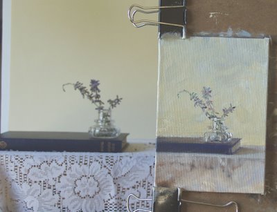
 Another first attempt gone bad. The painting just didn't hold my interest. Of course I had to go this far before I quit.
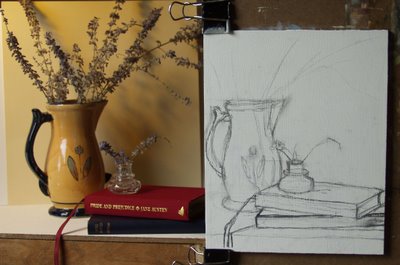 I like this layout better. Although ...I am having second thoughts about finishing the first one. Indecisions, indecisions...Remember, it's the practice that's important.
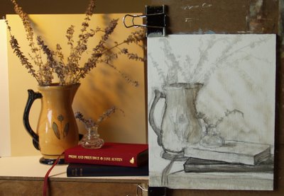 A light wash just to check the composition before applying paint.
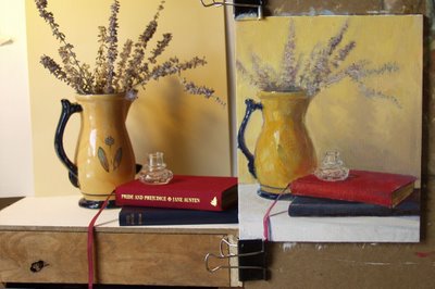 My wife came in took one look at the flowers in the ink well and my over stuffed arrangement and made a few adjustments. ( For the better I think, but don't tell her.)
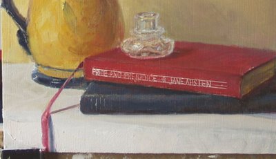 When I went to commercial art school, 150 years ago, they taught lettering. I was never very good at it. This was my fourth attempt at the title on the book, and my guide lines were crooked again!!! The easiest way I found to get a clear letter was to scratch it out with a nail.
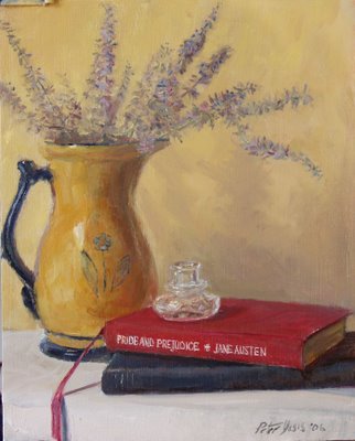 Reading Jane Austen
8"x10"
oil on masonite panel
SOLD
My wife came up with this great idea for a series of paintings. We both love books. (We can't pass by a used book store without taking a few hours to explore.) "Do a series of still lifes with books by authors we enjoy." she said. I admit she comes up with all the good ideas. Since her favorite author is Jane Austen, I started with that.
I placed the ink well on top because Jane Austen hand wrote all of those amazing stories with a quill and ink. Try writing a letter to someone with a pen that you dip into ink. They will enjoy it and you'll have a great lesson in patience.
Self critique time:
Today's critique is very simple, I don't think I did one thing right in this painting.
Oh my dear Jane...am I prejudice or just proud?
3 comments:
Neat idea - the book paintings Peter and they definitely have an "Austen" feeling to them. I wish the dark handle wasn't so close to the edge on the left...but I love the warm colors here and your value sketch makes a lot of sense. Do you know William Nicholson's paintings? You should take a look. The top one is interesting too and has a cooler Morandi-like feeling. Maybe it needs to be a horizontal painting?
Peter, they're both great. Don't give up on the first one. It wants to be something - I can feel it. Perhaps the arched window to an Abby in the background, or the suggestion of a distant door/room. Keep it going. :-)
You should be very proud of this, Peter. It is excellent! The first one also has a potential to very nice as well. Kepp going!
Post a Comment