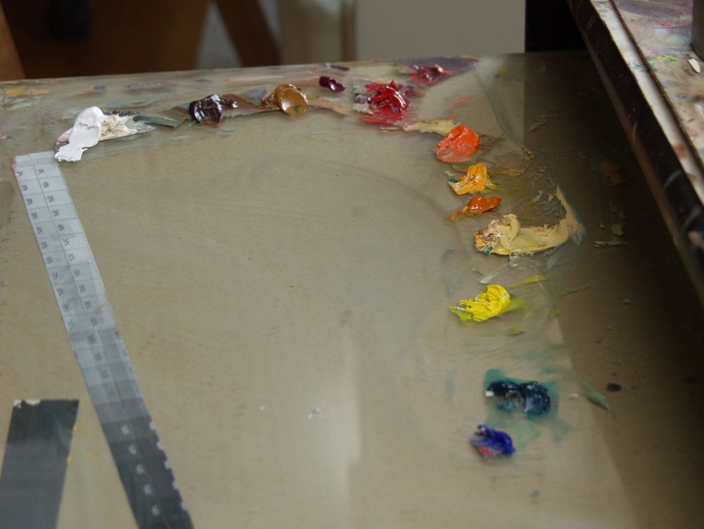
 Here's the palette I used. Titanium white, Burnt Sienna, Raw Sienna, Alizarin Crimson, Cadmium red, Cadmium Orange, Cadmium Yellow, Hansa Yellow, Yellow Ochre, Cadmium Yellow Light, Pthalo Green, Cobalt Blue
 This is how I started. Wash in the background with some Pthalo green and raw sienna and make placement marks with the darks. Then connect the dots.
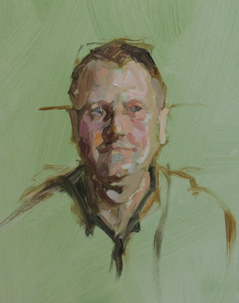 I just put value next to value. Try to catch the little positive and negative shapes. Don't think about anatomy. Not too refined but loose and effective.
 Note the slight hint of wearing my glasses on top of my head.
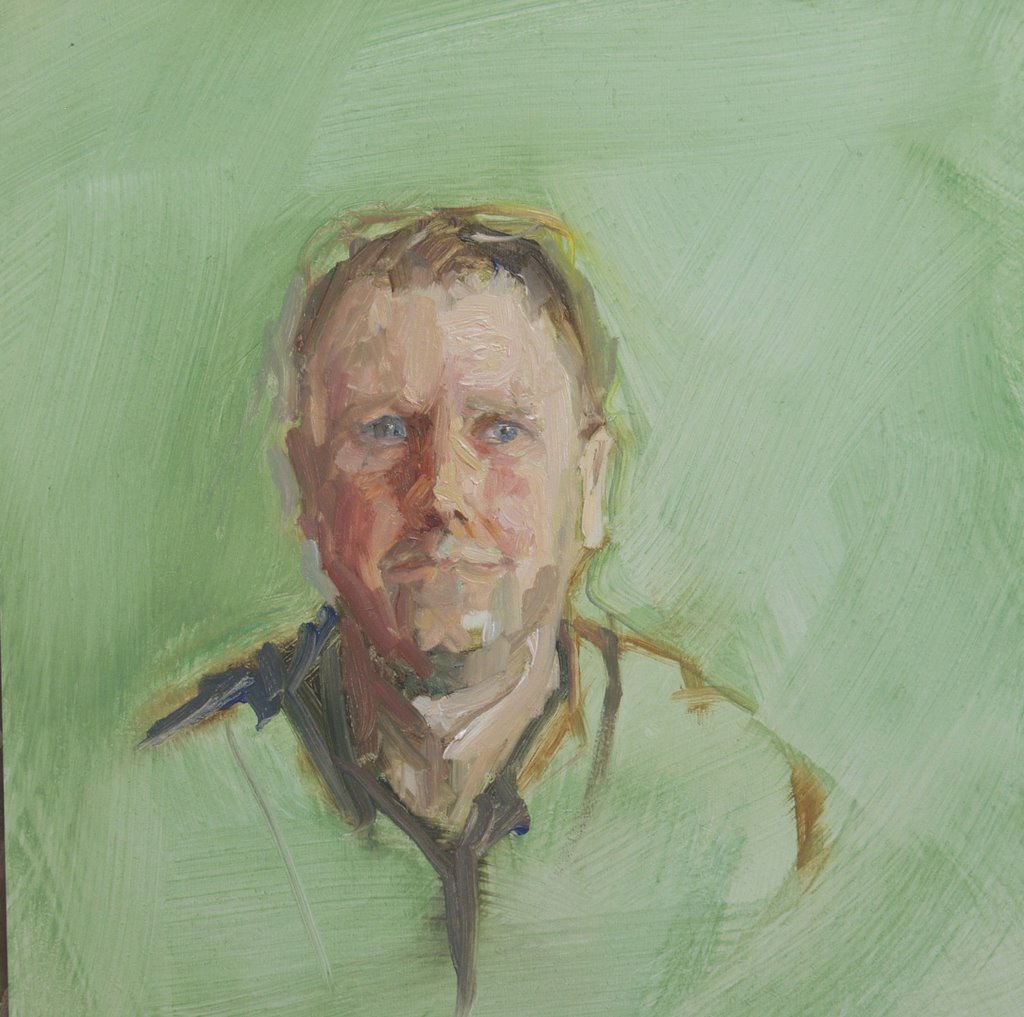 click on picture to enlarge the image
Self portrait practice
8"x10"
oil on masonite panel
I like how this one worked out. I attempted two more studies after this that I wiped off. I discovered an interesting hitch in my technique. If I paint with my glasses on and standing up I mess up more. I painted this study and the previous study sitting down and without my glasses. With my glasses off I don't see the details well enough to distract me from just painting values. The hard part is if I am any farther than an arms length away from the canvas I need my glasses, if I get to close I can't see the canvas. Getting old has it's challenges.
2 comments:
Peter!! These portraits are great!
OLD??!! You're still a pup!
Post a Comment